Shopping and entertainment centers have become an almost inevitable part of modern life with its time pressure: anchor supermarkets, chain stores, sports and play centers, boutiques, multiplex cinemas, food courts, even ersatz analogs of the “stall” fair, attracted by managers, coexist here. They have become popular centers not only for commerce, but for social life - it is not surprising that in the competition, shopping and entertainment centers need a memorable appearance, and more and more often the recent typology of hangars hung with billboards is being replaced by “iconic” sculptural imagery.
One example of this approach is the LIVERPOOL shopping mall, designed by the architectural firm SPRINGALL + LIRA, on the highway between Mexico City and Toluca.


The architects were faced with the task of designing a circular extension to the existing rectangular shopping center, located on a busy highway, where there are no pedestrian crossings and the minimum speed is 80 km / h. It is impossible to see anything in detail at such a speed, except to pay attention, to note an unusual shape. And the large streamlined volume, as if "swirling" by the wind, raised by the flow of the motorway, is paradoxical enough to attract even a superficial glance.
The form itself works as a very large signboard and - a curious bonus - it is extremely inconvenient to later cover the building with billboards not foreseen by the design.

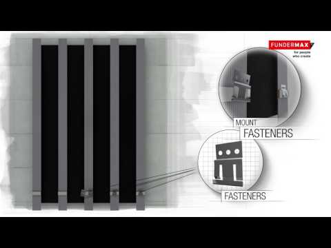
The Liverpool building stands out against the cool, laconic backdrop of the industrial cluster, not only for its shape, but also for its “wood” cladding with HPL panels. Max Compact Exterior Austrian company FunderMax. The panels can be mounted along a radius, which greatly expands the possibilities of their application. Although the panels are straight, the building is large enough so that the discreteness of the form is not too noticeable, and the shadows from the horizontal stripes are included in the volumetric play, graphically emphasizing the plasticity of the facades.
There are no windows: one of the rules of large shopping malls is that their internal space is self-sufficient, since it is known that without the opportunity to feel the change of time of day, it is easier for buyers to concentrate on shopping and wander among the stores for a longer time. But from the outside, a “house with no windows, no doors” can look unfriendly, so the architects used slot-like pause slots, not filled with panels. During the day they are dark, at dusk the linear illumination turns on, in tune with the tracing lights from the headlights of cars rushing at speed. The length of the strokes is different, which emphasizes the apparent "mobility" of the form.

More projects from FunderMax at www.fundermax.at and www.dekotech.ru.


